Shipped
I led the design of discount discovery- two features targeting different points in the funnel. Gives users a self-serve eligibility search tool, and a late-stage reminder to recover users without a discount applied.
COMPANY
MY ROLE
TEAM

Context
Sonnet offers member discounts to employees of 2,000+ partner organizations- employers, universities, and professional associations. Most eligible users had no way to discover it before starting a signup, and users who reached checkout without applying their discount were faced with a hard choice: abandon their progress and restart, or just pay full price.
Quick metrics:
56%
of users who saw the search tool clicked through to start sign up
2.9x
lift in auto checkout completion after late-stage discount was introduced
2.1x
lift in property checkout completion
Problem: Two separate drop-off points
Users with partner discounts weren't converting, partly because they didn't know they qualified, and because the system punished them for finding out too late.
TOP OF FUNNEL
Users had no way to check and verify eligibility before starting a signup.
Users who didn't know about the discount had no incentive to start.
BOTTOM OF FUNNEL
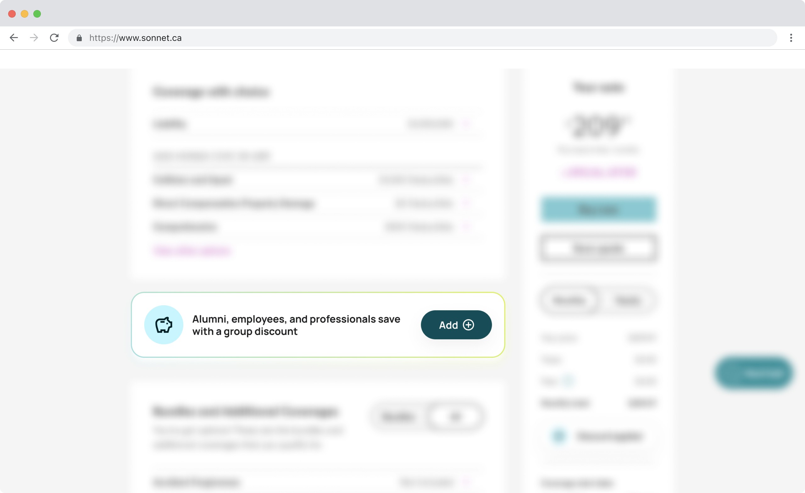
Users who skipped or missed the discount field early on couldn't add it later without restarting from scratch. The system was penalizing users for not completing something upfront.
part 01
Solution: Interactive search tool
A self-serve eligibility tool that gives users confidence before they commit to signup. No personal data required to find out if a discount is applicable.
Searches 2000+ partners
Provides instant confirmation
Research and discovery
I started with a cross-functional journey mapping workshop to identify where on the marketing site partner discounts were and weren't surfaced. We mapped user intent within the signup journey and marketing site, where confusion or drop-off was happening, and what a user needed to feel confident enough to start a signup.

We couldn't pass the organization name from the search widget into the signup flow in the MVP. This meant users would search on the landing page and need to re-enter their group in the next step- a known duplication.
It shipped anyway to get baseline data on whether the search tool drove signups at all.
Two approaches were explored and ruled out:
CONCEPTs EXPLORED -> REASON REJECTED
Second floating action button
A chat/support FAB already owned that position on mobile. Two competing FABs creates tap conflicts and unclear hierarchy.
Modal triggered by CTA
Interrupts reading flow and strips context. Users lose their place in the marketing content.
Inline search widget
Lives in the natural scroll flow. Supports marketing copy around it. Works within existing search infrastructure. Doesn't compete with other UI.
part 01
Results- one month post-launch
The widget shipped across 4 high-traffic partner landing pages. After 30 days of tracking:
56%
Of users who interacted with the search tool went on to start signup — strong signal that eligibility confirmation was the missing conversion lever.
4 pages
Initial rollout. The widget was designed to be CMS-embeddable, enabling expansion to additional partner pages without further engineering work.
What I'd do next
The biggest MVP cut was data passing. Users searching on the landing page had to re-enter their organization during signup. The next iteration is closing that loop: carry the search result into the signup flow as a pre-fill, reducing friction and improving conversion from search to completed signup.

part 02
Users were falling through a gap
There's an existing discount field near the beginning of the signup flow, but users were skipping it. Session recordings showed two patterns: users rage-clicking on an unintuitive "group category" selector, and users simply missing it entirely in the flow. By the time they reached the pre-checkout page and saw their price, the opportunity to apply a discount was gone. The only option was to restart.
Over 6,700 auto users and 4,400 property users passed through checkout monthly without a discount applied. Even with a modest recovery rate represented significant revenue.
AUTO
Driver's details page
24, 746 active users
-72.7% drop-off
Pre-checkout page
6, 763 active users | reminder shown here
26.7% quote to purchase
2.9x lift
PROPERTY
Confirm info page
9, 725 active users
-53.9% drop-off
Pre-checkout page
4, 487 active users | reminder shown here
35.7% quote to purchase
2.1x lift
Part 02 results- one month post-launch
WHAT THE DATA SURFACED
Analytics showed significant drop-off earlier in the funnel. Many users who were already price-sensitive left before reaching the pre-checkout page where the reminder lives.
WHAT i'd do next
The current reminder is passive as it appears once on the configuration page. Testing earlier placement (or a secondary reminder closer to the final confirm step) could recover the users who drop before they ever reach it.
I'd also revisit the original discount field UX. The session data from research is clear that the category selector is the core friction point, and fixing that upstream would reduce reliance on the secondary reminder entirely.
